Tuesday, 10 November 2009
Producing the Film Product
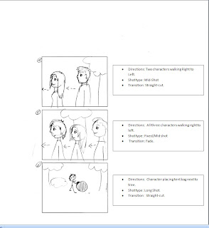
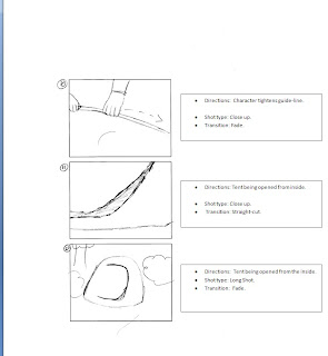
Analysis of Storyboard with Finished Product.


Film Magazine Front Cover Subsidery Task - Construction, Final Finished Product & Evaulation

I will now show the construction of my film magazine front cover whilst also explaining & describing the techniques I've used to create the final product.
The Masthead that I chose is certainly abiding to my simplistic style ideas, it sits in a bold, brilliant white on top of the page. The position of the Masthead is very important, I placed it so that the first few characters of the magazines title could be seen in the left third, this means that the magazine is very easy to identify even before you pick it up. The theory behind this is if you see a magazine and only the left third is visible you can identify it very easily.
I used a Black font with a white outer-glow for the coverlines, still in keeping with my design style. I have left justified the coverlines as they appear on the left side of the page, this not only looks much neater but it allows me to maximise and save some space in the centre of the page. The puff that I used is very simple yet is very competitive sounding, "THE NO.1 FILM MAGAZINE" this is positioned directly underneath the Masthead and is thus one of the first pieces of text that the reader would see upon first looking at the magazine.
My main article image is created from two different photographs, I took a photograph of one of my actors against a white background, then imported the image into Adobe Photoshop. I used the magic wand tool, feathered eraser and the lasso tool to cut around his outer profile. I then layered this image on top of the background.
Evaluation
I am quite happy with the finished end result. I feel that I've used what I've learnt from my research very well, aspects of font design, positioning and colour selection in relation to the main article image have helped me create a high quality product that I am fairly pleased with. I feel I have fulfilled my original design brief perimeters firstly my main article image is exactly as I outlined in my design brief. My font stands out from the background and is eye catching. I have used the bold/regular/bold/regular effects very well in the bottom section of the front cover and the other coverlines are also very visible. The design of my front cover is mostly based around the "Left-third" idea that I researched. All of these aforementioned aspects of design have been carried out successfully.
To conclude I feel I have a created a magazine front cover that is to a high standard and quality and by sticking to my simple yet effective design brief I have made the most of my research. I feel that the choices that I made throughout have been good ones and I'm very happy with my finished product.
Film Poster Subsidery Task - Construction, Final Finished Product & Evaluation

I will now show the construction of my film Poster whilst also explaining & describing the techniques I've used to create the final product.
To begin with I wanted to use a simple colour scheme that would connote the depth and feeling of the film. I wanted to use a mostly black and white colour scheme, there are three reasons I chose this. Firstly I found that Black and white can stand out to a greater degree than full colour, the huge contrast between the two colours is responsible for this. Secondly in a world of film posters mostly being in colour this poster design is in the mostly black and white minority, finally I feel that when I use the third and final colour which is a dark green it stands out effectively.
The main Image is a photograph of a local forest, it's of a high angle shot of the forest canopy with the sky showing through. I then took this image and placed it upon a white background. I then applied a visual effect to the image known as the "Torn paper" effect, this breaks the image down to just black and white, but it also finds and sharpens the edges where the two colours meet. The image is placed in the centre towards the top of the page leaving space for the films title, tag-line and credits.
I wanted to use a selection of simple, straight forward fonts; most notably i used "Arial" for the film title and tag-line for specifically that reason. The simple font types fit in with sort of simple theme I had envisioned. The other font that I used on the poster is "Rockwell Condensed", this font is identical or at least very similar to what most professional film posters typically use. I adjusted the character spacing of the font to bring the characters closer together, this allows me to include more details in a smaller space.
To conclude, I believe this project has been carried out to the best of my abilities whilst adhering to the requirements that I had laid out in my design brief and created a final product that is attractive and eye catching thus making it a potentially successful film poster in the real world.


